December 15, 2010

Showcase -Winter Campaign: Covert Affairs & Burn Notice Posters and Billboards


Showcase loves sexy. Its always loved sexy, but nowadays the desire is for a smart sexiness that will increase women’s viewership without losing its longstanding appeal to men. The brief for Showcase’s returning season of Burn Notice requested a tone that was “Sexy+Clever+Polished”. Likewise the Series Premiere of Covert Affairs called for a “Sexy+Stylish+Dangerous” tone.
Zoning in on the desired tone added up to a slick unified look for the two spy series that precisely struck the Sexy/Smart sweet-spot.

Showcase was deeply satisfied with Covert Affairs launching at more than double its estimate and Burn Notice launching at 11% over estimate (a strong accomplishment for a season 2). And achieving increased female viewership was the cherry on top.

Imaging & Design: Rob McNeil
Copy: Munro Cullen & Steve Parker

HGTV Winter


September 01, 2010

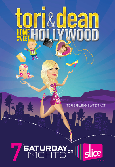
Slice - Saturday Nights


Tori & Dean Home Sweet Hollywood Poster
Illustration by Jenny McCracken

Real Housewives of D.C. poster
concept and collage
Wall Mural

Summer print advertising for Slice’s top two shows on Saturday Nights

August 30, 2010

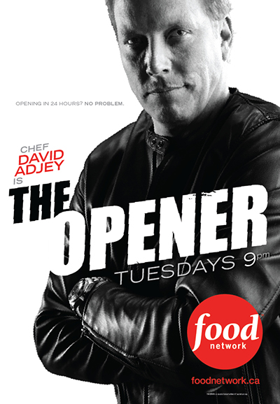
Food Network - The Opener


Poster


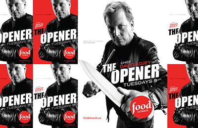
 Wild Postings


Wall Mural

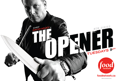
This campaign sought to launch the new show in a striking way and help build David Adjey’s profile as a Food Network celebrity. The Opener follows Adjey as a kind of tough-love antihero helping aspiring restauranteurs avoid disaster on opening day. So the creative was designed to have a contemporary action-poster aesthetic.
Photography: Jason George
Copy: Steve Parker

June 03, 2010

Canwest Coming Attractions - Upfronts Media Event


Shards in action on the big screen


Details of a section of wall graphics that wrapped around the entirety of the giant concession island


Shard graphics designed to obscure the view of the rival Citytv building otherwise seen out the windows, including window vinyls and a movie channel text mural.

The ‘Upfronts’ is a crucial annual media event in the television industry where returning hits and new shows launching in the Fall are showcased to the advertising industry.
I created the overall look for the event and developed the signage that redecorated the whole of Scotiabank Theatre (the venue). In doing so, I unwittingly made ‘shard’ the most used word around the office for a few weeks, as these colourful graphic elements founded the key visual theme. The look was created to work well with the theatre’s existing busy interior and dynamic structure and the colours were used to contrast the venue’s metallic look.